Mobile-First Design That Actually Works
Build responsive websites starting from the smallest screens. We cover adaptive layouts, touch navigation, and breakpoint strategies proven across thousands of devices.

What You’ll Learn
Practical, hands-on knowledge for building interfaces that work everywhere.
Mobile-First Foundation
Start with the smallest screen. Design for 320px first, then scale up. This forces you to prioritize what matters and build faster sites.
Touch-Friendly Interaction
Buttons sized for thumbs, not mice. Learn hit target sizes, spacing patterns, and navigation designs that don’t frustrate mobile users.
Flexible Layouts
Flexbox strategies for adapting content to any screen. No rigid grids — layouts that breathe and respond naturally to their containers.
Breakpoint Strategy
Which breakpoints actually matter? We skip the one-size-fits-all myth and show you how to choose breakpoints based on your content.
Image Optimization
Responsive images that don’t waste bandwidth. Picture elements, srcset attributes, and lazy loading techniques that work across devices.
Performance Matters
Mobile users don’t wait. Learn CSS optimization, viewport settings, and techniques to keep sites fast on slower connections.
How to Build Responsive Sites
The workflow we recommend, step by step.
Start Small
Write HTML and CSS for mobile first. No frameworks, no assumptions about screen size. Just semantic markup and base styles that work on 320px displays.
Add Breakpoints Progressively
As you increase viewport width, add media queries only when content needs adjustment. Don’t guess — test real devices and real browsers.
Test Everything
Resize your browser. Test on actual phones and tablets. Check landscape and portrait orientations. Performance matters — measure it on slower networks.
Optimize and Ship
Minify CSS, optimize images, minimize JavaScript. Monitor real-world performance with tools that matter. Keep iterating based on user feedback.
What Developers Say
Real feedback from people who’ve applied these techniques.
“I wasn’t sure about the mobile-first approach at first, honestly. But once I stopped designing for desktop and started from 320px, everything got easier. CSS is simpler, sites load faster, and I don’t have to fight the layout anymore.”
“The breakpoint strategy section changed how I work. We’ve stopped using the same three breakpoints for every project. Now we actually analyze the content and choose breakpoints that make sense. Site performance improved immediately.”
“Touch targets that are actually big enough, navigation that doesn’t require pinch-zoom — our users are noticing. Mobile engagement went up 40% after we redesigned the interface around these principles. Didn’t even expect that improvement.”
Featured Resources
Start with these three guides. They’ll change how you approach design.

Starting with Mobile-First Design Principles
Begin with the smallest screen and scale up. We cover why this approach works better and how to structure your CSS from the ground up.
Read Guide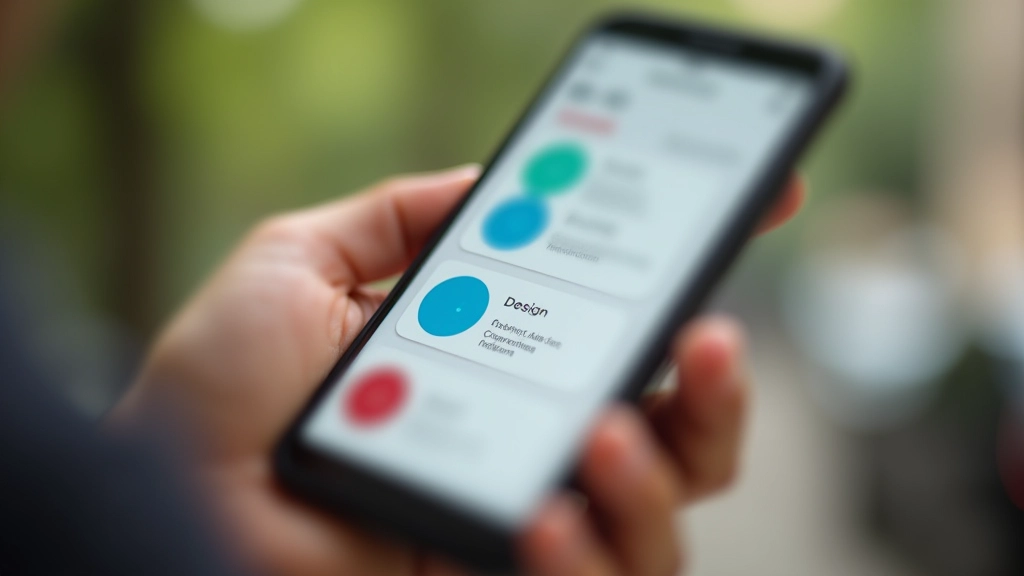
Touch-Friendly Navigation Patterns That Work
Buttons, menus, and interactions sized for thumbs. Avoid the common mistakes that frustrate mobile users and improve accessibility.
Read Guide
Screen Breakpoints: Setting the Right Values
Which breakpoints should you use? Common mistakes, modern approaches, and why one-size-fits-all breakpoints don’t work anymore.
Read GuideCommon Questions
We get asked these a lot. Here’s what you should know.
Do I really need to design mobile first?
Not forced, but it works. Mobile-first forces you to prioritize content and features. You’ll end up with simpler, faster sites. Most teams that try it stick with it because it’s just better.
What breakpoints should I use?
There’s no magic number. We recommend starting with 640px and 1024px, then adding more based on where your content actually breaks. Test with real content, not arbitrary numbers.
Can I use CSS frameworks like Tailwind?
Absolutely. Mobile-first principles work with any approach — vanilla CSS, Tailwind, Bootstrap, whatever. The mindset matters more than the tools.
How do I optimize images for responsive design?
Use srcset and picture elements to serve different image sizes to different devices. Lazy load images that aren’t immediately visible. We’ve got a full guide on this.
Does responsive design affect performance?
It can help it. Mobile-first CSS is usually leaner. The key is being intentional — don’t send desktop images to mobile devices, don’t load unnecessary JavaScript.
What about older browsers?
Flexbox and media queries work in everything that matters now. If you need to support ancient browsers, we’ve got fallback strategies documented.
Ready to Build Better?
Join developers and designers who’ve transformed how they build for mobile. We’ll help you understand the principles, master the techniques, and ship faster.
Contact Us Today