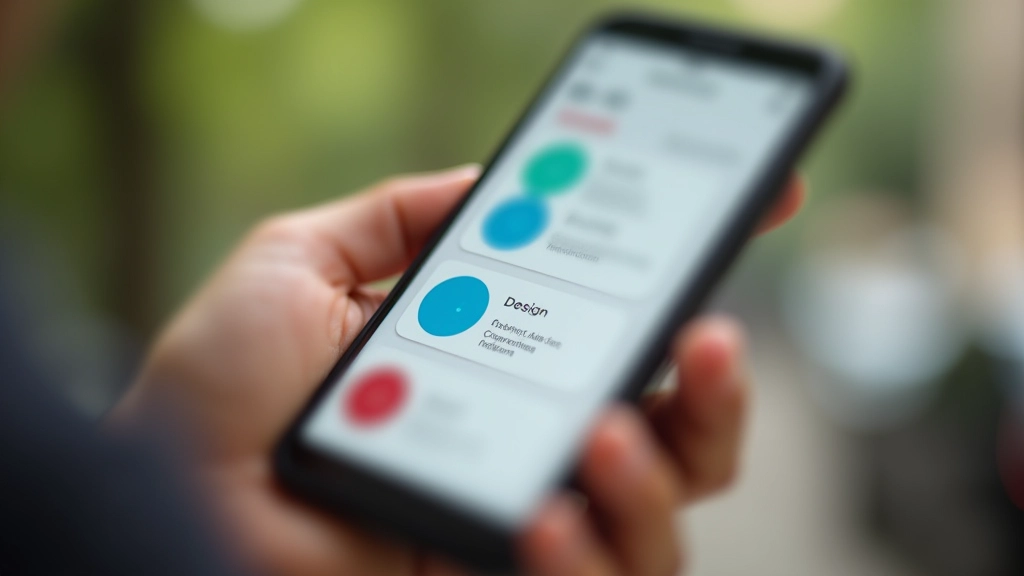
Touch-Friendly Navigation Patterns That Work
Buttons, menus, and interactions sized for thumbs. Avoid the common mistakes that make mobile navigation frustrating.
Read ArticleBegin with the smallest screen and scale up. We cover why this approach works better and how to structure your CSS from the ground up.

Most developers still build desktop layouts first, then squeeze everything down for phones. It’s backwards. Mobile-first design flips this approach — you start with the smallest screen and add complexity as space increases. That’s not just a trend. It’s fundamentally better.
Here’s the thing: mobile users outnumber desktop users by roughly 4 to 1 globally. If you’re not designing for mobile first, you’re prioritizing the minority experience. Plus, starting small forces you to make harder choices about what actually matters. No bloat, no unnecessary features cluttering up your interface.
Three principles that change how you approach responsive design
Mobile layouts are inherently simple — single column, essential content only. That’s your baseline. Everything else builds on top of it.
Use min-width media queries instead of max-width. Add features, spacing, and complexity only when the viewport can handle it.
You’re not overriding mobile styles with desktop overrides. Instead, you’re progressively enhancing. Less fighting your own code.
A practical step-by-step approach for writing mobile-first styles
Your CSS for an element shouldn’t be wrapped in any media query. It’s the mobile version. Full width, single column, touch-friendly sizing. That’s your foundation. Everything else is enhancement.
At 768px, you’ve got more horizontal space. Maybe a two-column layout makes sense now. Maybe padding increases. Use @media (min-width: 768px) to layer in these changes on top of your mobile base.
Large screens get the full treatment. Multi-column layouts, wider spacing, larger typography. You’re not rewriting styles — you’re enhancing them. Add what makes sense at this size.
Let’s look at something concrete. You’re building a card component. On mobile, it’s 100% width, stacked vertically. On tablet, maybe three cards per row. On desktop, four cards.
Here’s how you’d write it mobile-first. You start with the mobile version as your base. No media query needed. Then, at 768px, you switch to a three-column grid using flexbox. Finally, at 1024px, you go four columns. Each breakpoint adds capability without undoing what came before.
The key insight: You’re not managing two separate designs. You’re managing one design that gracefully adapts. Mobile first makes that approach natural because you’re always building up, never tearing down.
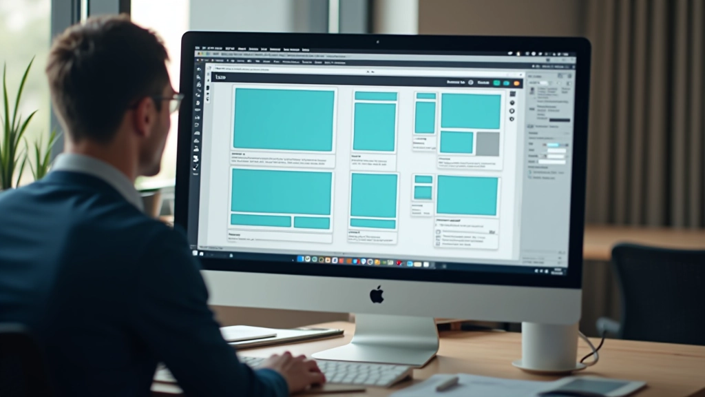
Beyond the philosophy — practical advantages
Mobile-first doesn’t automatically make sites faster, but the mindset does. You’re thinking about constraints from day one. You won’t load a 2MB hero image on mobile because you started there. Your CSS file is smaller too — no unnecessary desktop overrides cluttering things up.
Future you will appreciate this. When you need to change how cards look, you update the base styles once. Changes cascade up to tablet and desktop automatically. No hunting through max-width queries trying to figure out what breaks what.
Start testing on actual mobile devices. See your design in its most constrained form. It forces you to make better decisions about hierarchy and content. Desktop testing comes later — it’s often a pleasant surprise when everything just works.

This defeats the whole purpose. @media (max-width: 768px) means you’re writing mobile as an override to your desktop code. Flip it around. Use min-width breakpoints and you’re naturally building up.
Your phone’s browser emulator is helpful for quick checks, but nothing beats testing on actual devices. Touch feels different. Performance is real. Screen sizes vary. Don’t skip this step.
The standard breakpoints (320px, 768px, 1024px, 1440px) work for most projects. Don’t pick random numbers. Consistency across projects makes life easier. Stick to conventions unless your design absolutely demands something different.
On mobile, buttons and links need to be at least 4444 pixels. Fingers are imprecise. A link that works perfectly with a mouse fails spectacularly on touch. Design for fingers, not cursors.
You don’t need to redesign your entire project right now. Start with your next component. Pick something simple — a button, a card, a navigation element. Write the mobile version first. No media queries. Just base styles that work on a 320px screen.
Then add your tablet breakpoint. See how it feels. Add desktop. Notice how the CSS stays clean because you’re building up, not down. After a few components, you’ll see why this approach is worth it. It’s not just about philosophy — it’s about writing code that’s easier to maintain and a design that actually works for your users.

Mobile-first design isn’t just a buzzword. It’s a pragmatic approach that makes your code cleaner, your sites faster, and your designs more thoughtful. You’re starting with constraints, which forces better decisions. You’re building up instead of tearing down, which keeps your CSS maintainable. And you’re prioritizing the experience for the majority of your users.
The next time you start a project, open your editor and think 320px first. Write your base styles without any media queries. Then scale up. You’ll feel the difference immediately. Your future self will thank you when it’s time to maintain this code six months from now.

This article is provided for educational purposes to help you understand mobile-first design principles and responsive web development practices. The techniques and approaches discussed represent common industry standards and best practices as of March 2026. Your specific project requirements may differ, and you should adapt these principles to your unique context, target audience, and business goals. Browser support, device capabilities, and web standards continue to evolve — always test your implementations across real devices and browsers before deploying to production.