Touch-Friendly Navigation Patterns That Work
Buttons, menus, and interactions sized for thumbs. Avoid the common mistakes that frustrate mobile users and improve accessibility.
Why Touch Design Matters
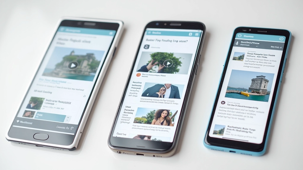
Most web designers still design for mouse and keyboard first. But here’s the reality: about 60% of web traffic comes from mobile devices. That means your navigation needs to work for thumbs, not cursors.
The difference is significant. A mouse pointer is tiny — we’re talking pixels. A thumb is 40-50 pixels wide. When you design for fingers instead of pixels, everything changes. Users stop missing buttons. Tap targets become reliable. Your site becomes genuinely usable.
We’re not talking about complicated redesigns. Small, practical changes to your navigation patterns make a huge difference in user experience and accessibility.
The Core Principles
Three fundamental rules that guide all touch-friendly design decisions
Minimum 48px Tap Targets
The WCAG guideline exists for a reason. Forty-eight pixels is the sweet spot between comfortable for thumbs and efficient use of space. Most sites use 44px minimum — that works, but 48px is safer. Anything smaller than 40px frustrates users.
Adequate Spacing Between Targets
Users miss taps when buttons are crammed together. You need breathing room between interactive elements. Eight to sixteen pixels between buttons prevents accidental taps on the wrong target. It’s the difference between a pleasant experience and frustration.
Clear Visual Feedback
On desktop, hover states are optional. On mobile, they’re essential. Users need immediate confirmation that they tapped something. That means color change, scale shift, or shadow adjustment happening instantly when they touch a button.
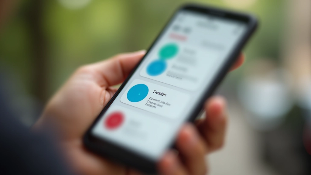
Bottom Navigation: The Standard
Bottom navigation is the most comfortable pattern for phones. Your thumb naturally rests at the bottom of the screen. When navigation lives there, users can reach it without shifting their grip.
Here’s what makes it work: icons should be 24-28 pixels with 48-pixel minimum tap targets. The bar itself sits 8-16 pixels from the screen edge. Labels are optional below icons, but they improve clarity. If you include labels, keep them to one or two words maximum.
The best practice: limit bottom navigation to 3-5 items. More than that, and users get confused about which button does what. A sixth item is possible but cramped. If you need more, use a hamburger menu for secondary items instead.

Hamburger Menus: Do Them Right
The hamburger menu gets criticized, but it’s not going away. When designed properly, it’s functional and space-efficient. The problem? Most implementations don’t follow basic touch guidelines.
Start with the icon itself. It should be 24-32 pixels with a 48-pixel tap target around it. The three lines need at least 2-pixel spacing between them. When tapped, it should transform into an X icon or slide in a panel from the edge — never just disappear.
Menu items inside should follow the same 48-pixel rule. Space them 12-16 pixels apart. Use clear, descriptive labels. Don’t use tiny icons as the only indicator — pair them with text. And crucially: make sure users can close the menu easily by tapping the X, tapping outside the menu, or hitting the back button.
Tab Navigation: Common Mistakes
Tab interfaces look elegant on desktop. On mobile, they often fail because the tap targets are too small. You’ve probably seen this: a row of four tiny tabs with text, barely 40 pixels tall, squeezed across a phone screen.
Here’s the fix: make each tab at least 48 pixels tall. If you have more than 3-4 tabs, scroll them horizontally instead of cramming them all visible. Indicate which tab is active with color, underline, or background — never rely on text alone.
Consider swipe gestures as a secondary navigation method. Users expect to swipe between tabs on mobile. Implement this with touch listeners if your site uses JavaScript. But don’t rely on swipe as the only way to change tabs — always include tappable indicators too.
Mistakes That Frustrate Users
Watch out for these patterns that destroy the touch experience
Tiny Buttons Near Each Other
Users tap the wrong button constantly. You see a 32-pixel button next to another 32-pixel button with 4 pixels between them. It’s a recipe for missed taps and user frustration. Minimum button size is 48 pixels, minimum spacing is 8 pixels.
No Tap Feedback
User taps a button and nothing happens visually. Did the tap register? Should they tap again? On mobile, immediate feedback is critical. Color change, scale shift, or opacity change must happen instantly when touched.
Hamburger With No Close Option
Menu opens, user gets stuck. There’s no X button, no tap-outside-to-close, nothing. They have to hit back button or find a hidden close mechanism. Always provide obvious ways to close menus.
Hover States Only
On mobile, there’s no hover state. Designers often forget this and design interactive feedback only for desktop hover. Mobile needs active/focus states that work with tap, not just hover.
Implementation Checklist
Before you launch your navigation, run through this checklist. It takes 10 minutes and catches most common issues.
All buttons and links are minimum 48px 48px
Spacing between interactive elements is 8-16px
Active/tap states provide clear visual feedback
Navigation is accessible at both portrait and landscape
Text labels accompany icons (or clear icon meaning)
Users can close menus easily

Test With Real Fingers, Not Cursors
The best way to catch navigation problems is to test on actual phones. Not DevTools. Not a mouse cursor on your desktop. An actual thumb tapping your actual navigation on a real mobile device.
Test in different contexts too. Standing up while moving. Sitting down. One-handed and two-handed. Left hand and right hand. That’s how users interact with your site in the real world. If buttons are hard to hit when you’re standing in a crowd holding a coffee, they’re too small.
Ask 3-5 people unfamiliar with your site to navigate it on their phones. Watch where they struggle. Don’t help them. Let them figure it out. Their struggles are your design problems.
Navigation That Feels Natural
Good touch navigation isn’t about following trends. It’s about respecting how people actually use phones. A 48-pixel button isn’t fancy. It’s just considerate. Proper spacing between options isn’t cutting-edge design. It’s user-centered thinking.
The sites users love aren’t impressive because of complex navigation patterns. They’re loved because navigation gets out of the way. Users find what they need without thinking about it. That’s the goal.
Start with these patterns. Test with real users. Adjust based on what you learn. Your navigation will improve, your bounce rate will drop, and your users will actually enjoy using your site on mobile.
Ready to Improve Your Navigation?
Review your current mobile navigation against the checklist above. Even small adjustments make a noticeable difference in user experience and accessibility.
Explore More Mobile Design TopicsAbout This Article
This article provides educational information about touch-friendly navigation design patterns and best practices. The guidelines and recommendations are based on established web accessibility standards (WCAG), usability research, and industry best practices. Results may vary based on your specific context, user base, and device capabilities. Always test your designs with real users on actual devices. For specific accessibility requirements, consult official WCAG guidelines and usability testing frameworks.
Related Articles

Starting with Mobile-First Design Principles
Begin with the smallest screen and scale up. We cover why this approach works be…
Read Article
Screen Breakpoints: Setting the Right Values
Which breakpoints should you use? Common mistakes, modern approaches, and why on…
Read Article
Flexible Image Placement Across Devices
Images that look good everywhere. Learn responsive image techniques, picture ele…
Read Article